TasteBudsYour Tastebud's Best Friend
Overview
Roles
User Experience Design
Visual & Interface design
Brand Identity
Project Management
Design Methods
User Surveying
Market Analysis
User Task Analysis
Journey Mapping
Information Architecture
Wireframing
A/B Testing
Usability Study
Iterative Prototyping
Heuristic Evaluation
Duration
2 Iteration Cycles, Over 3 Months
Tools
Figma, Qualtrics, Illustrator, Photoshop
Recipeexplorationisdated,lackinginmodernfeatures,inefficientlyorganized,andstillbloated.
TheChallenge
Websites are still largely employed with two-fifths of Americans* utilizing them for recipe searching, additionally, 71% of adults** are now taking to social media platforms like Facebook for food-based inspiration.
TheApproach
To make a recipe sharing and exploration platform that is less bloated than websites, that is more specialized and concise for recipe formatting and organization compared to social media solutions, while maintaining their dynamic sharability and accessibility for creators and explorers.
-
Citations
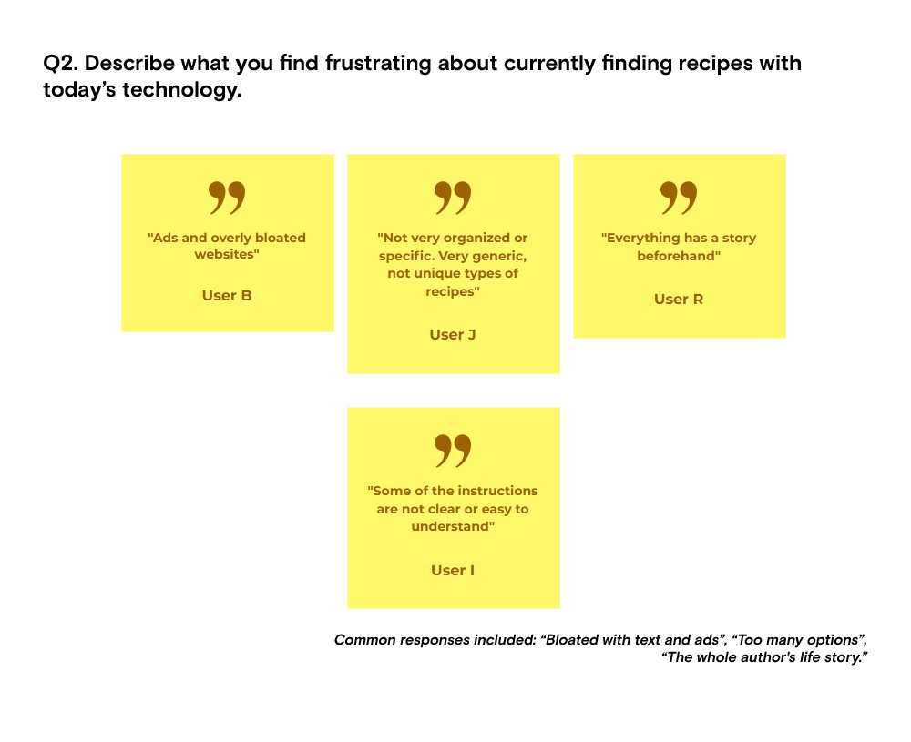
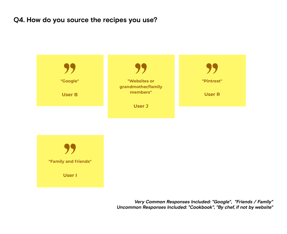
WhatDoOurPotentialUsersThinkofTheirCurrentOptions?
UserSurveying
By sampling feedback from potential users about other similar solutions on the market, we can narrow down the features and reveal a direction to take the app for a better end product that accommodates consumers based on their wants and needs rather than our assumptions.
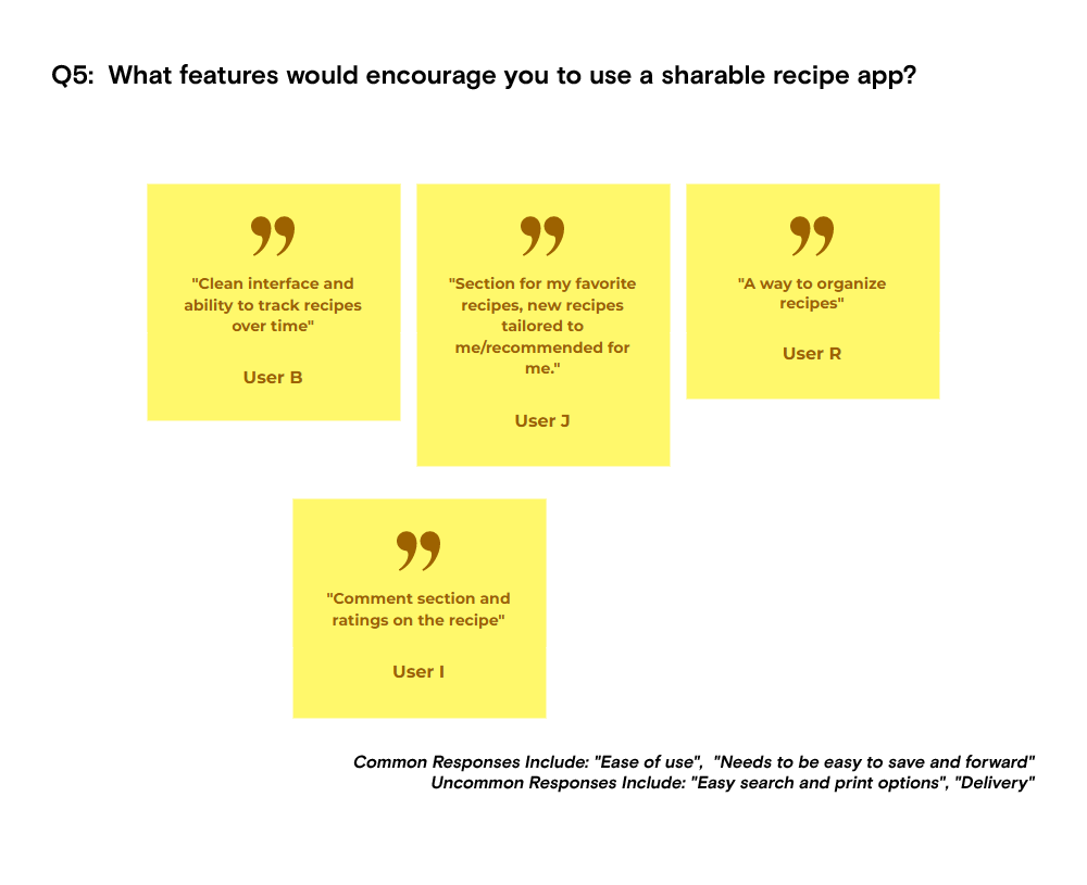
OurTakeaway
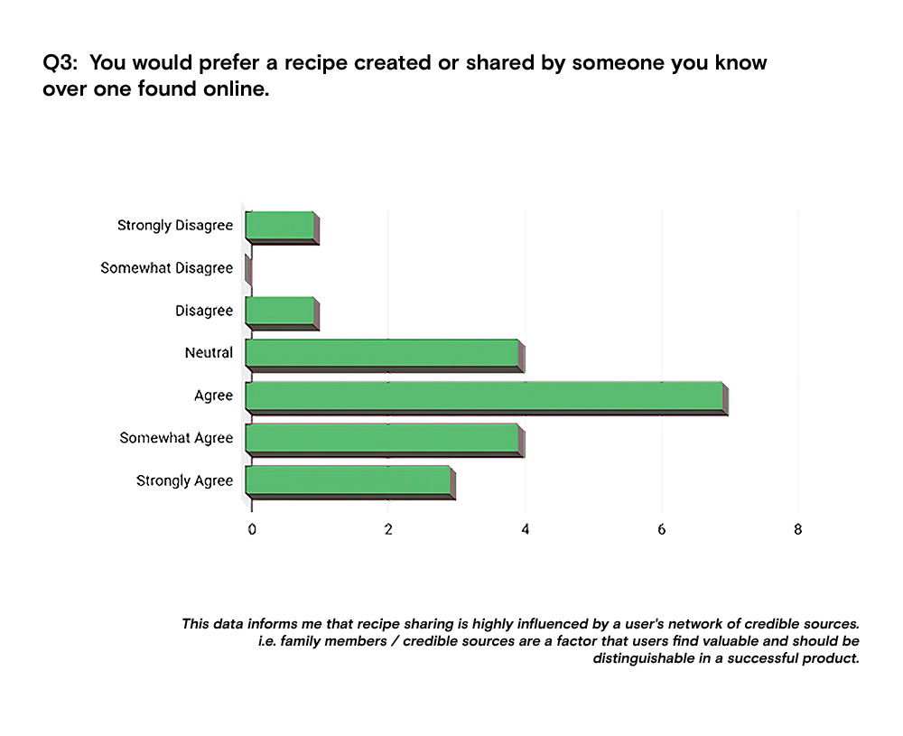
We've revealed that our problem statement is a valid problem based on our test group. Internet-based recipe research is the prominent platform for most users. People value credible sources for recipes, a social network may appease these needs.
WhatNow?
If people do not like website-based platforms but stick with them for convenience, and use social media for reliable networks and sources, why don’t people look for available app-based options dedicated to recipes and social networks? Let's see our options.
EvaluatingOurOptions.
MarketAnalysis
We conducted research in the relative market, searching through existent and established products to find similar concepts and neighboring functions and what we found was Whisk.
Pros&Cons
Utilizing feature matrices, user surveying, and a usability study to analyze task flows, we evaluated the product to identify its pros and cons to find a potential opening to improve upon.
OurTakeaway
Whisk is a cutting-edge recipe app that answers many problems in this space, providing a multitude of relevant and effective features for its users to share and build a community around the food that they enjoy. While we may not be reinventing the wheel or beating everyone to market, there is always room to improve or view the same problems differently.
Based on our testing we found that their app still felt bloated in many ways. It includes many social features that added up to a lot more UI than our test users were willing to interact with. Additionally, some reported that recipe exploration was not as engaging as they would have liked it to have been.
WhatNow?
So while Whisk could be seen in the light of an enthusiast app with many social features, we believe that there could be another answer to our problem that accounts for casual users as well.
Whatbasicfunctionswillourusersbecompleting?
Prototyping:IterationOne
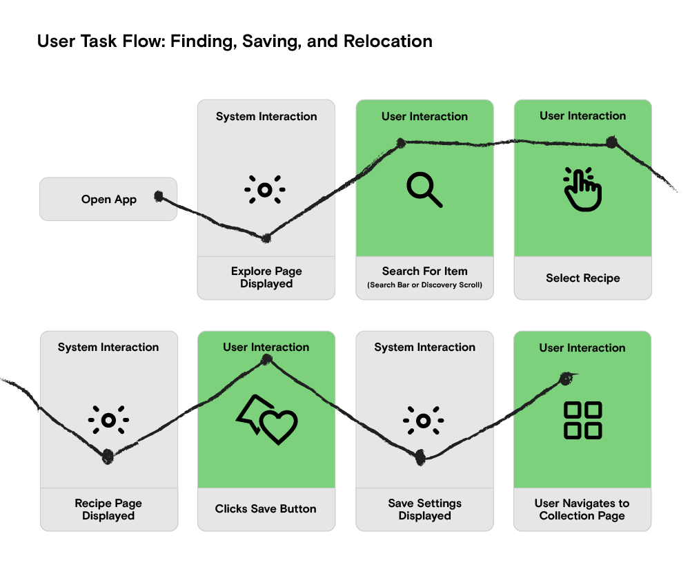
Reflecting upon our previous learnings with Whisk, we decided to build our initial task flow around the same task we used to test their usability, finding recipes, saving them, and relocating them within their collection, ensuring we at least have the basic recipe interactions properly integrated.
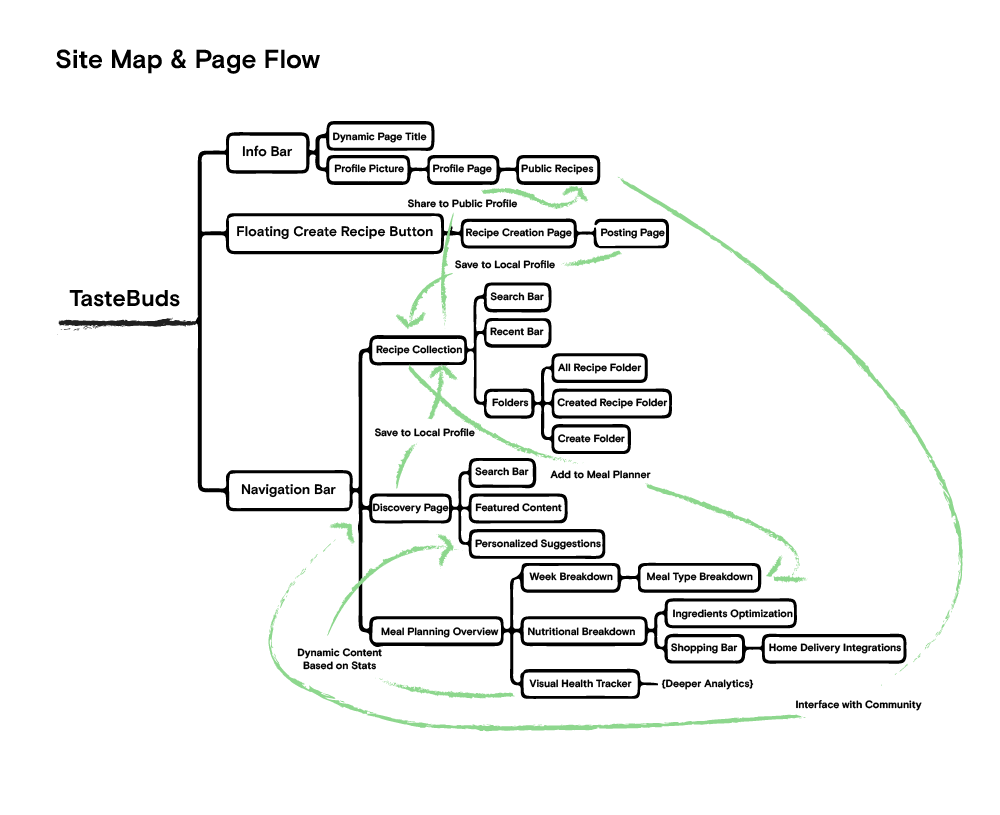
We first began by building flow maps to envision the interaction loop, additionally, then we broke down the information architecture into a site map so we could build the interaction into a properly laid out low-fidelity wireframe.
DesigningforCasualUsers
Following this, we drew up three looks, a minimalist look, a maximalist look, and a moderate look in between the two, as to A/B Test and defign the range of complexity we can align with, as to avoid feature fatigue and overstimulation.
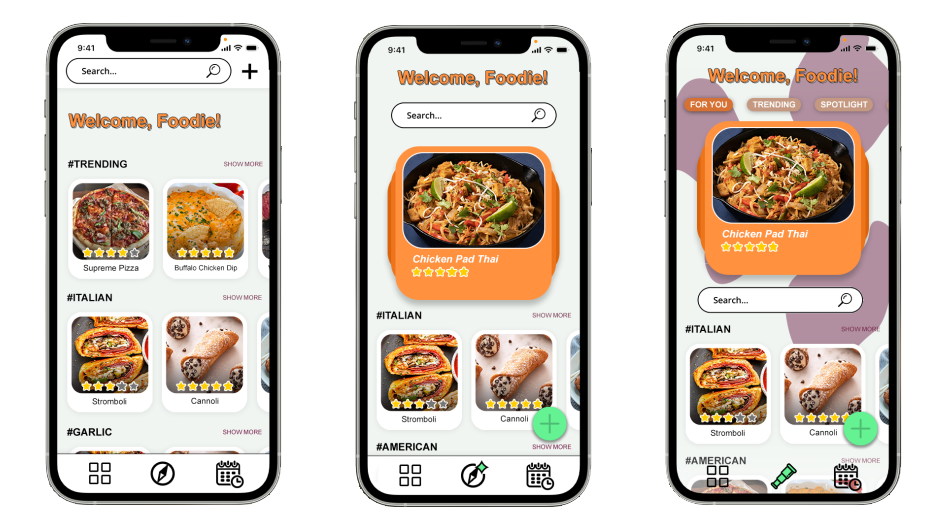
SimplebutProgressive
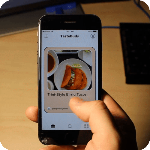
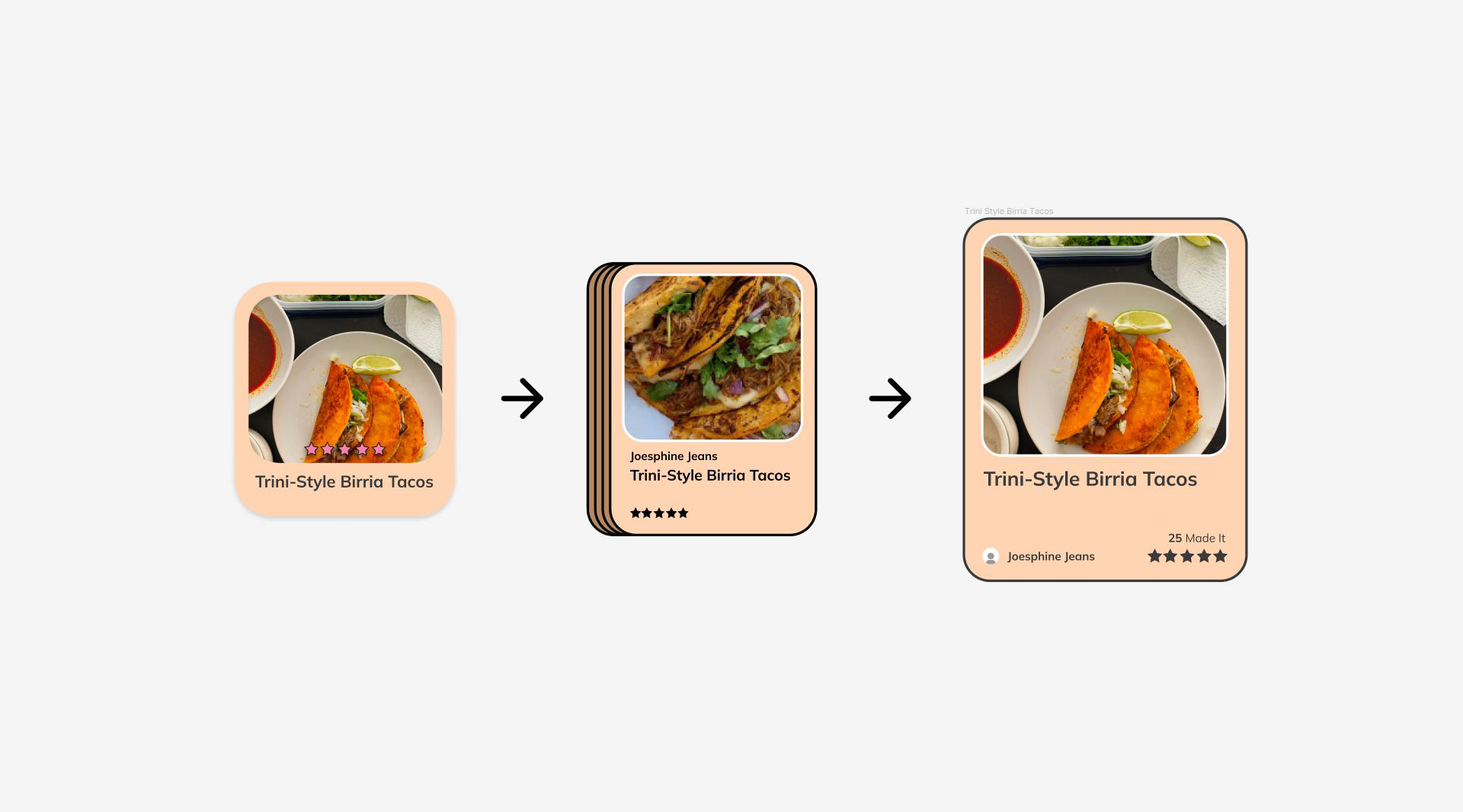
Users decided between the options and chose the moderate option because of it's simplicity as well as it's slightly experimental interaction, a large cardstack swiping feature.
BuildingBasedOnFeedback
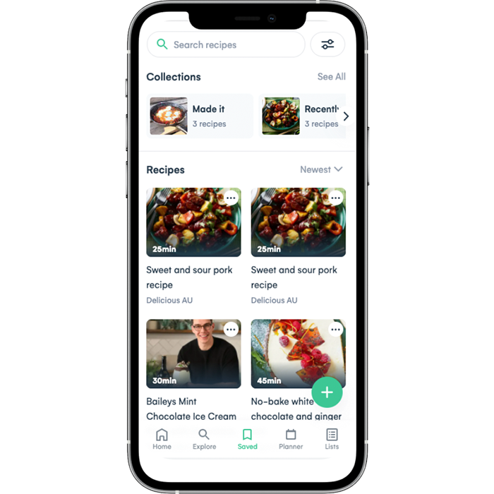
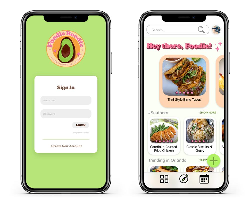
After gathering information about which design users identified with, we built interactive prototypes in Figma so we could gather even more information about how we could improve the user interactions.
TestingOurFoundation.
UsabilityStudy
We surveyed and tested our users with our Hi-Fi prototype as to develop a good understanding of where we would be able to innovate with interactions in our final product.
Testing usability against our previous task analysis test with Whisk will allow us to identify where design shortcomings and advances occur in our prototype compared to their design.
We will do this by having the user communicate with a think-aloud protocol defining what actions they are contemplating and attempting to capture confusion and their thought process, we will be quantifying user blunders alongside the time to complete the task.
Following this, we will be directly interviewing and asking for subjective feedback on what, why, and how to improve the design.
OurTakeaway
The testing revealed areas for improvement in UI interactions as users did encounter confusion and made mistakes during the task flow.
Participants provided both positive and negative feedback about their experience. Most found the app strong in potential creativity and content presentation, however, issues with spacing, composition, uniform coloring, and minor element placement were noted as causing distraction.
Direct recommendations for future drafts included improving the placement of the create button, simplifying UI colors for better call-to-action interactions and uniformity, and maintaining element sizing consistency.
WhatNow?
Iterating upon the first version of this app, we will design a more visually consistent and interactable model that builds upon how the information will be navigated and absorbed.
Evaluation,Constraints,andRefinement.
Prototyping:IterationTwo
Reflecting upon the previous list of 'to-dos', rebranding the visual aesthetic seemed like a good place to begin to take into consideration the consistency, and effectiveness of the current materials utilized for the prototype.
We approached this new challenge by enlisting a purposeful design constraint, making the prototype for smaller screen devices. This will force us to boil down our existing components into their essentials.
HeuristicEvaluation
Referring to the 10 Usability Heuristics of UID we can approximate a consistently aligned design over our previously validated foundation.
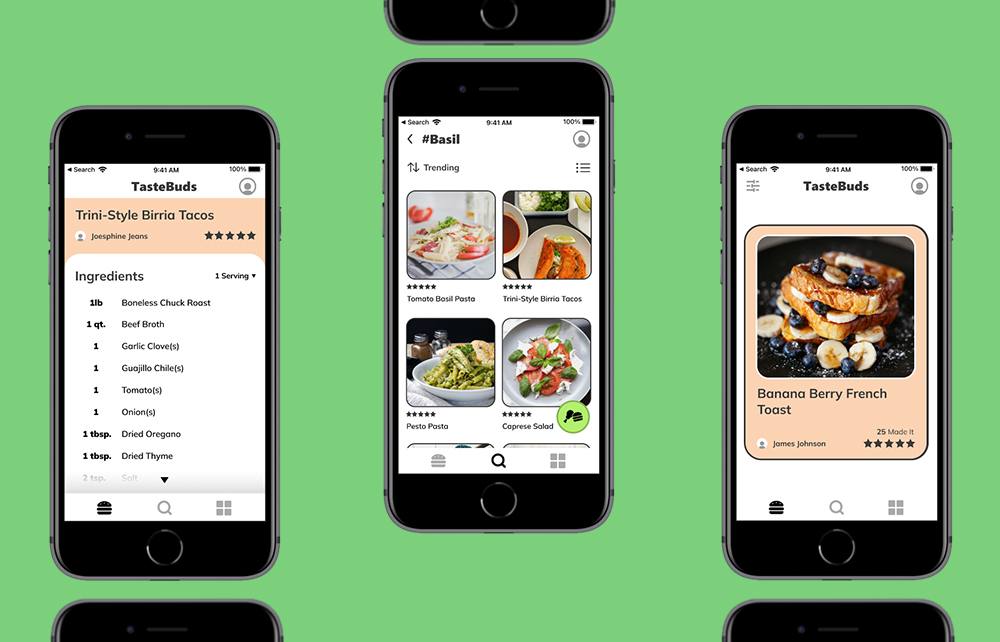
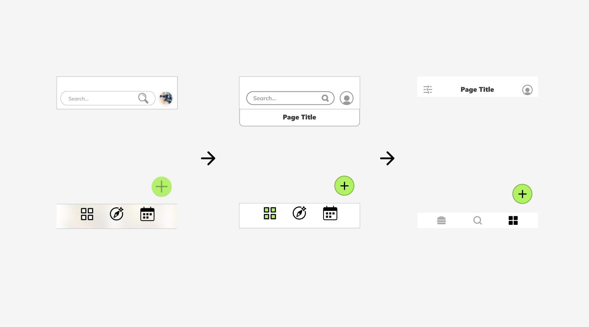
RecognitionRatherThanRecallHeuristic:
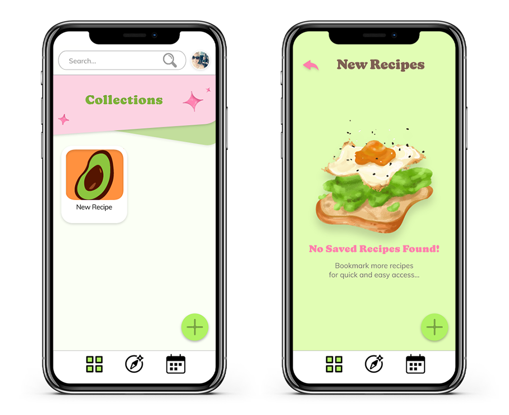
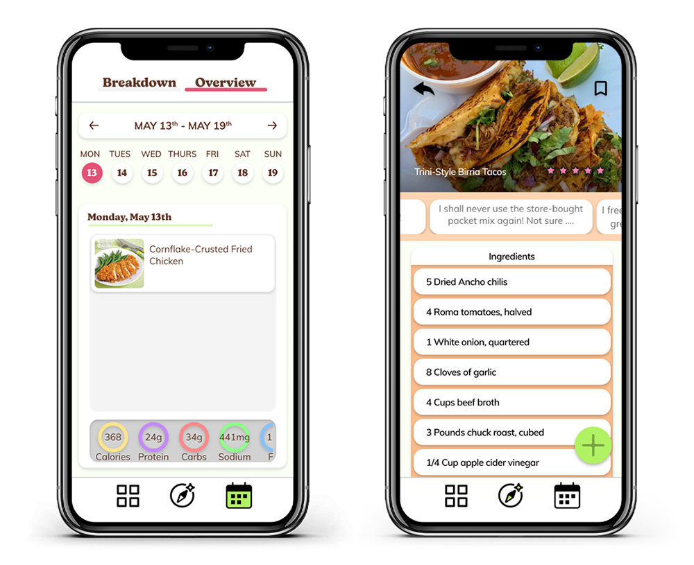
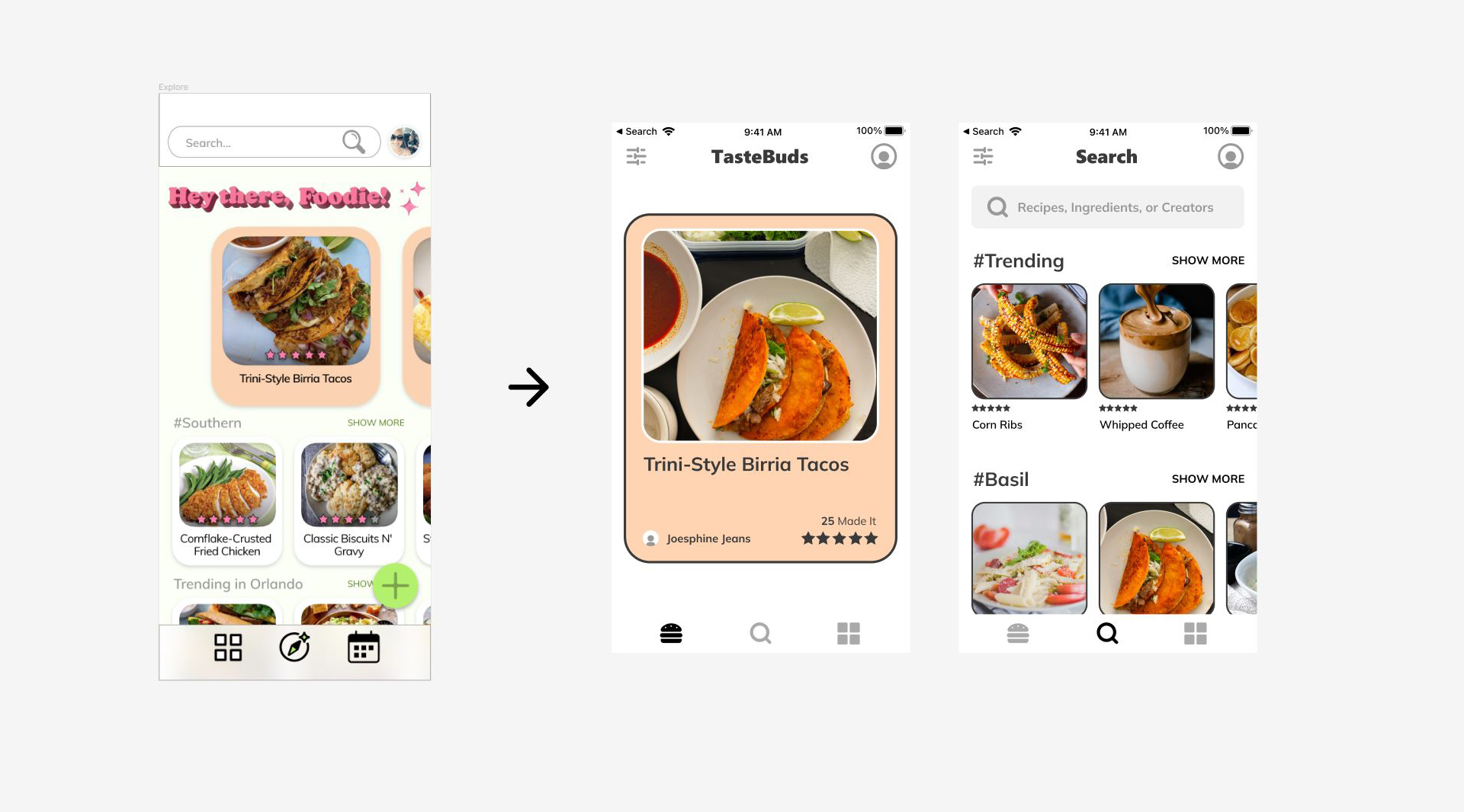
We have broken down the exploration feature into two separate functions, a deliberate searching screen, and a passive suggested results screen.
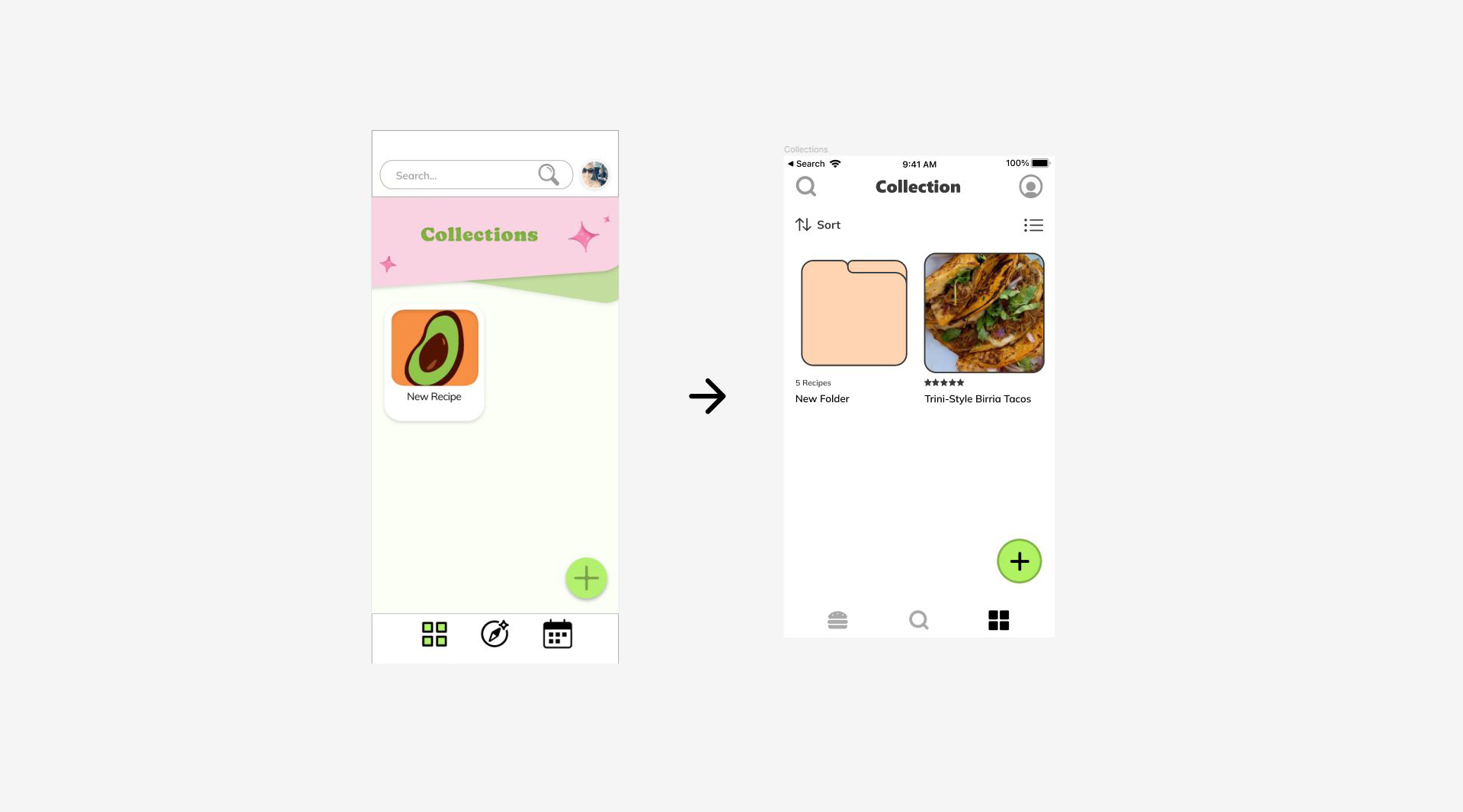
Features used in the previous prototype that are now accessory to our current model we employ contraints removing the meal planner from immediate navigation simplifying the mental model and therefore refign our core interactions.
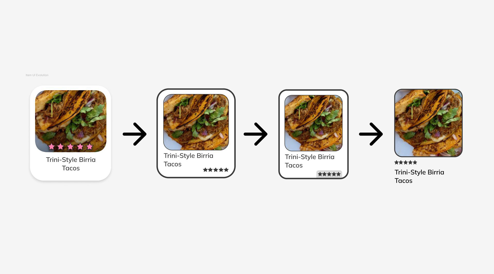
High-contrast strokes have been added to element containers and cards to improve readability.
The color range has been redefined by applying the 60-30-10 rule with green being specifically assigned to the call-to-action color.
AestheticandMinimalistDesignHeuristic:
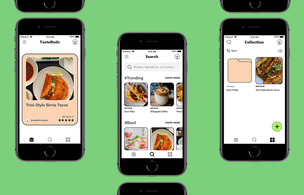
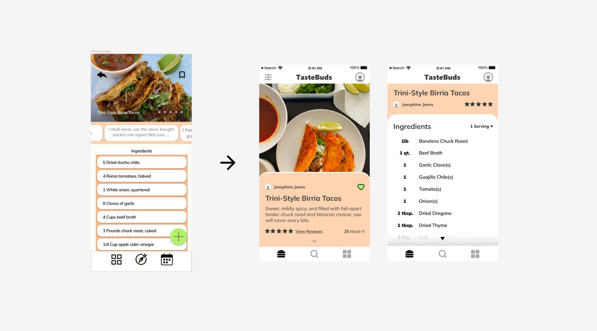
In light of our moderate design approach and new canvas size, we adopted compact elements suitable for all screen scales. The look of several key elements such as the recipe icon, navigation menus, explore page, recipe page, and collections page have all been refined.
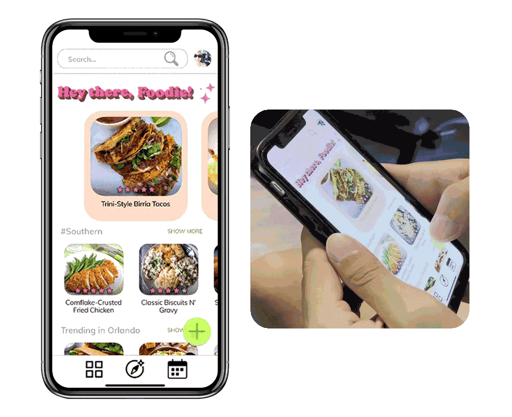
The swiper stack has also been updated to improve interactability pulling inspiration from dating apps, which use card swipe stacks allowing users to quickly identify relevant information and move to the next item, allowing for quick discoverability.
ConsistencyandStandardsHeuristic:
Documentation including Material Design by Google and Human Interface Guidelines by Apple have been referenced to refine buttons, navigation elements, page structure, components, layout, and spacing.
Prebuilt Figma canvases have been used to ensure the elements are framed appropriately for the prototype.
Reflection
Further usability studies will be necessary to validate the swiper function and overall impression of the second iteration, however, we have learned a lot about identifying functions and realizing where they would belong in a more simplified model to this challenge.
Monetization channels of this product have also been considered however felt irrelevant to integrate at this point of the prototype.
The philosophy to creating monetization elements in the future would have to revolve around creating non-invasive channels that are less bloated compared to the competition. A/B testing much like what we did with the composition previously holds the key to identifying how much users will feel comfortable interacting with.