The Glass Eye WebstoreAn Exploration of Webstore Interfaces
Overview
Roles
User Experience Design
Visual & Interface design
Design Methods
Market Analysis
Information Architecture
Visual Mockup
High-Fidelity Prototype
Duration
2 Months
Tools
Figma, Illustrator, Photoshop
CreatingaStylizedWebstoreTemplateEmpoweredbyMobile-FirstDesign.
TheChallenge
For modern brands, having a coherent and stylized webface and functional webstore is one of the most valuable tools for digital e-commerce.
It is essential to design a streamlined and personalized shopping experience for mobile users first because they are also more selective about their shopping approach on mobile devices and they are the predominant web shoppers.
TheApproach
We will adopt a mobile-first approach to our design a solution that focuses primarily on branding and stylization.
Whatexperiencesdoesthemarketcurrentlyprovide?
NavigationandSearchingSystems
Many webstores use overly complex navigation menus, simplifying these navigation hierarchies and options will allow users to not feel overwhelmed when looking for products.
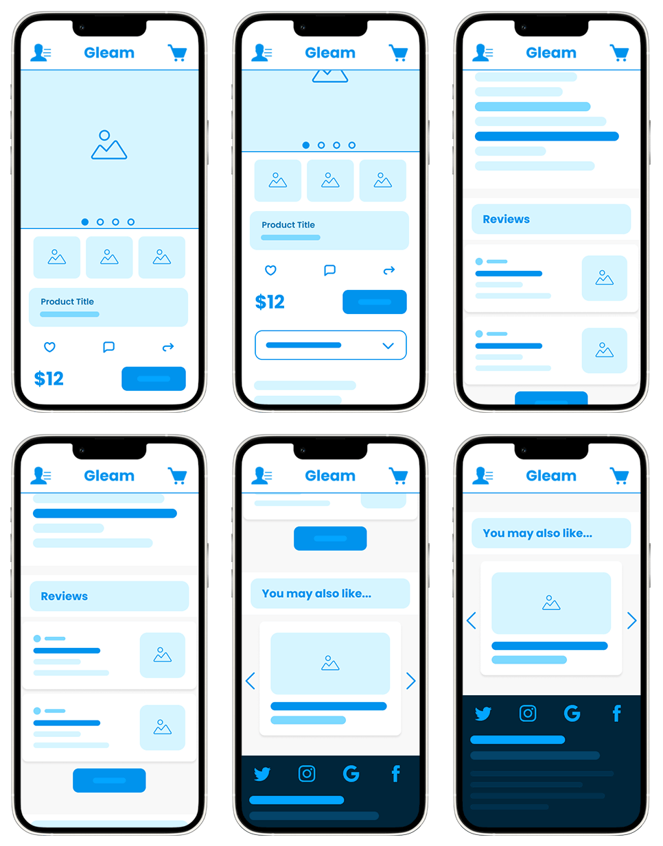
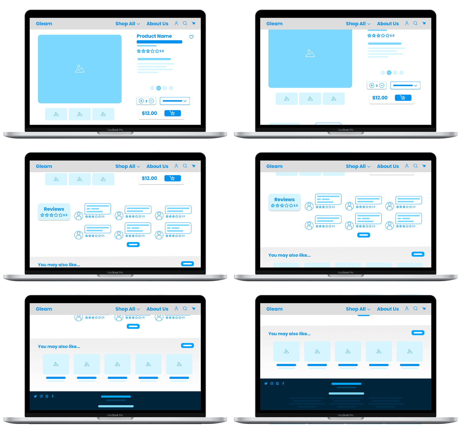
CommonProductPageOrganizationSystems
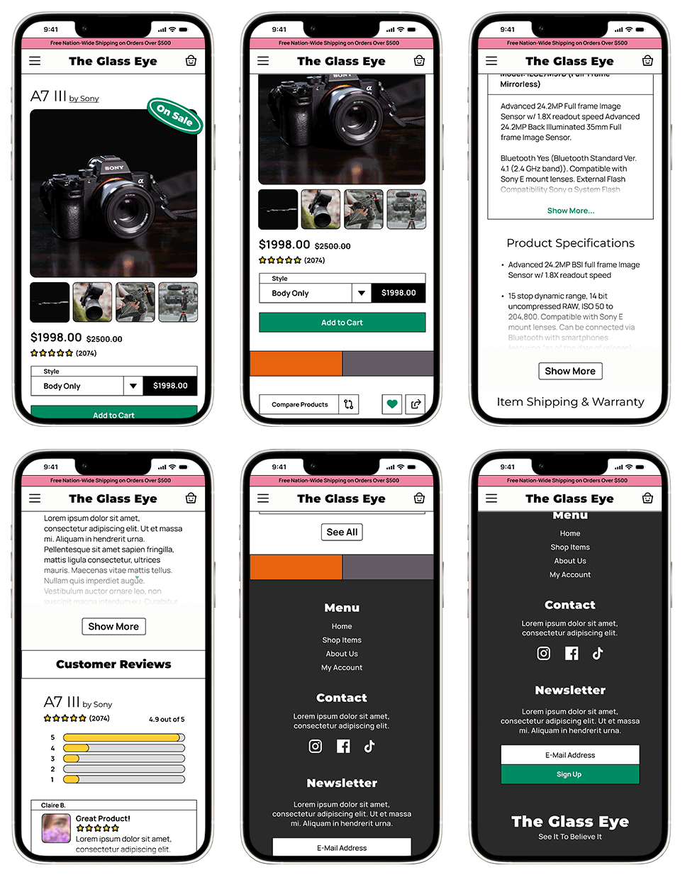
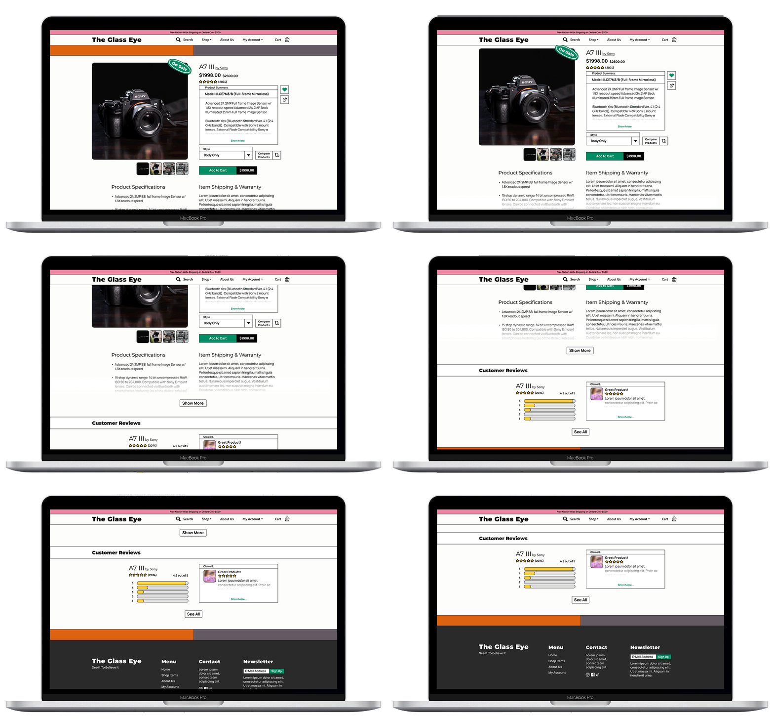
By breaking down the page content into key elements and priority we can build a hierarchy of information to gather an understanding of what needs to be shown to the user first for efficient communication. From this, we can create a framework that allows us to feel familiar to users as well as build a consistent product across multiple platforms like mobile and desktop.
Product Photos
🡩
Product Title
🡩
Product Details
🡩
Convergent Recommendations
🡩
Product Reviews
🡩
Divergent Product Recommendations
WhatNow?
By cross-analyzing the information architecture and market research, we can look at making a mockup that is informed by both the needs and behaviors of our target audience and the current state of the market.
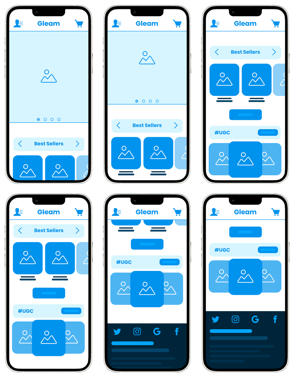
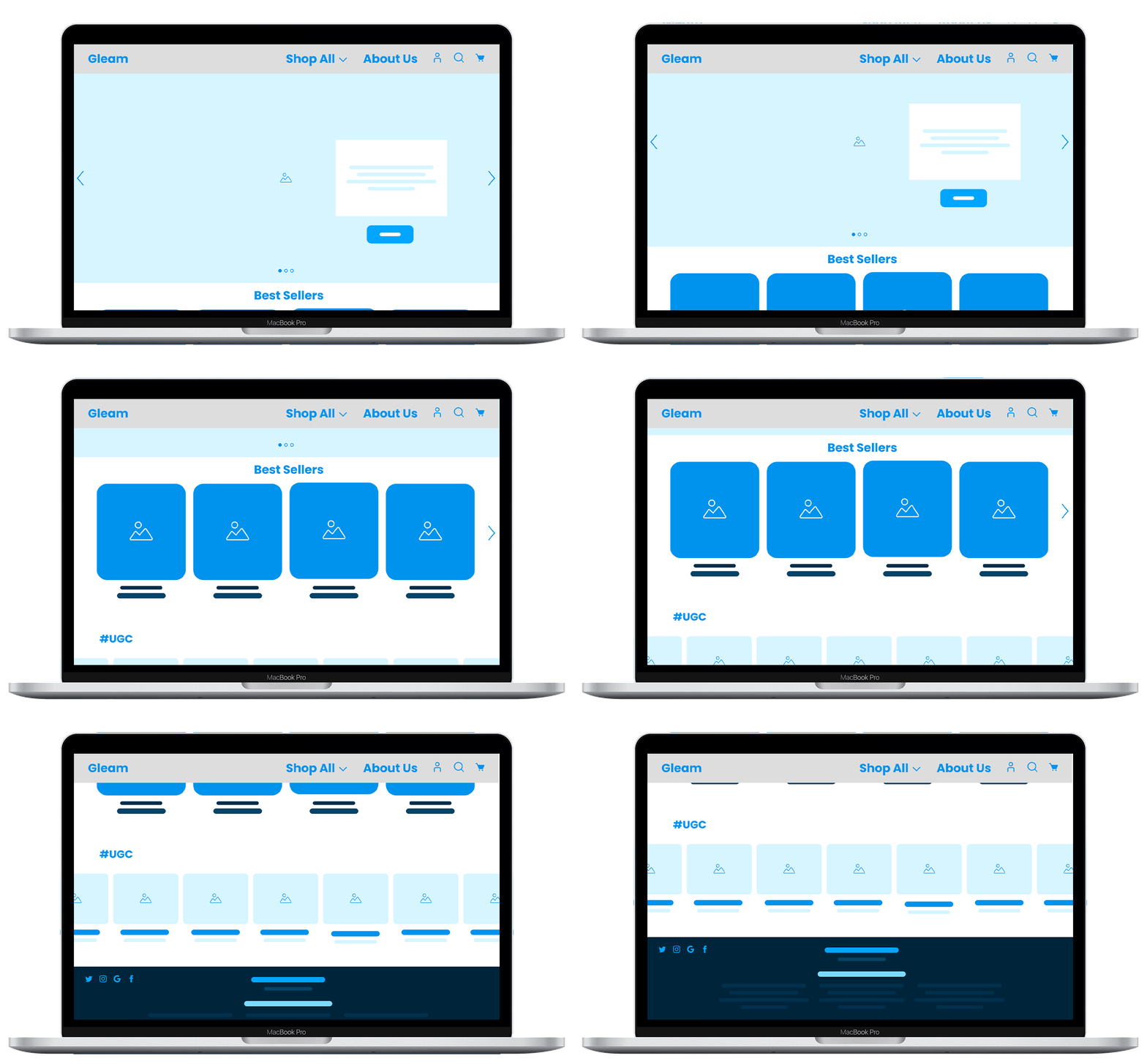
UnderstandingHome&ProductScreens.
Wireframing&Mockups
The approach begins by analyzing the Information Architecture we laid out earlier so we can activate the design based on what users need and expect to see first.
By utilizing an asset pack in Figma, we can quickly create a medium-fidelity mockups that provide a better understanding of how elements will appear on the webpage.
WhatNow?
By combining the mockups into a cohesive and easy-to-use navigation solution, we can streamline the user experience and create a more user-friendly design. This approach allows us to address the pain points identified earlier and improve the overall user experience, ideally resulting in higher user satisfaction and reduced bounce rates.
Evaluation,Constraints,andRefinement.
Prototyping
By utilizing survey-like prompts, we can guide users towards products that align with their preferences and needs. This approach empowers us to personalize the shopping experience and provide tailored recommendations that are more likely to resonate with each individual user.
The survey asks customers a series of questions related to their interests, budget, style, and size, and based on the responses, the system directs them to the appropriate sections of the shop store. By guiding customers directly to the region of products they are most interested in, they can easily sift through options without wasting time searching for products themselves.
Reflection
Further usability studies will be necessary to validate the swiper function and overall impression of the second iteration, however, we have learned a lot about identifying functions and realizing where they would belong in a more simplified model to this challenge.
Monetization channels of this product have also been considered however felt irrelevant to integrate at this point of the prototype.
The philosophy to creating monetization elements in the future would have to revolve around creating non-invasive channels that are less bloated compared to the competition. A/B testing much like what we did with the composition previously holds the key to identifying how much users will feel comfortable interacting with.


